Payment Calculator

Project Background
The Vehicle Detail Page (VDP) is one of the most important steps in the vehicle shopping journey, where customers evaluate a vehicle's details and financing options before deciding whether to move forward.
While the page provided a significant amount of information, user engagement data showed that customers were not consistently progressing to key next-step actions, such as saving financing terms and scheduling a dealership visit to start the purchase process. Analytics and session recordings suggested that users were overwhelmed by the amount of information presented and often struggled to identify the most relevant content or understand how to move forward.
To better understand the problem, I analyzed user behavior, reviewed session recordings, and evaluated engagement with financing-related tools on the page. The findings revealed an opportunity to simplify the experience, reduce visual clutter, and surface the right information at the right moment in the customer journey.
The goal of this project was to create a clearer path forward for shoppers by improving the hierarchy of information, reducing cognitive load, and increasing engagement with key actions that help customers continue through the purchase funnel.
Research & Discovery
Before exploring solutions, I wanted to understand why customers were not progressing to key actions on the Vehicle Detail Page. To uncover the root cause, I combined behavioral research, analytics, and competitive analysis.
Behavioral Analysis
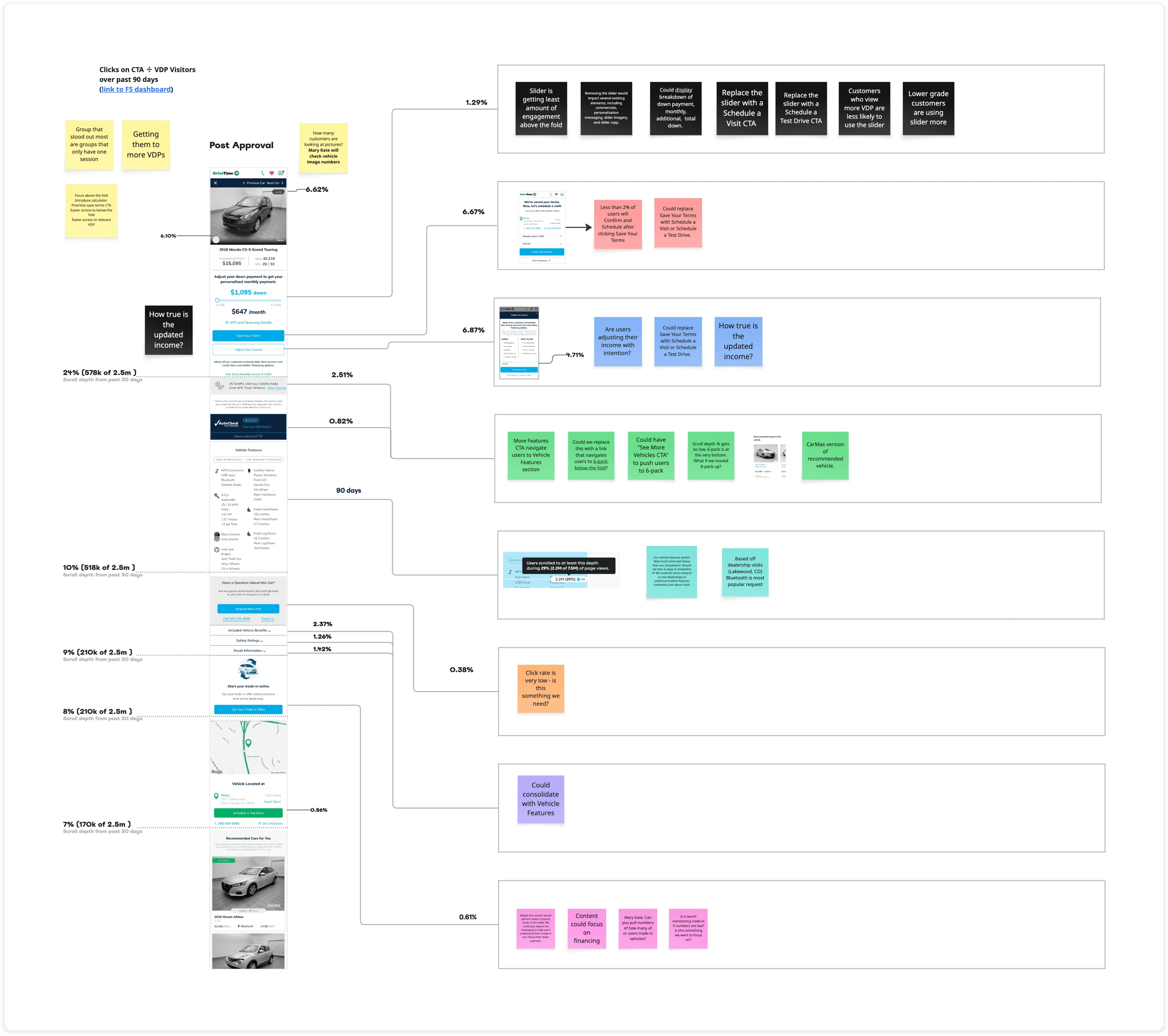
I reviewed FullStory session recordings to observe how customers interacted with the VDP. This helped me identify areas of friction, understand how users engaged with financing tools, and uncover patterns that quantitative data alone could not explain.
One of the most notable findings was that customers frequently interacted with financing controls but often lacked a clear understanding of how those interactions impacted their options or what step to take next. Users would repeatedly adjust financing inputs, explore different payment scenarios, and spend time within the financing experience without consistently progressing through the purchase journey.
Analytics Review
I collaborated closely with our analytics team to understand engagement across the VDP and identify where customers were dropping off.
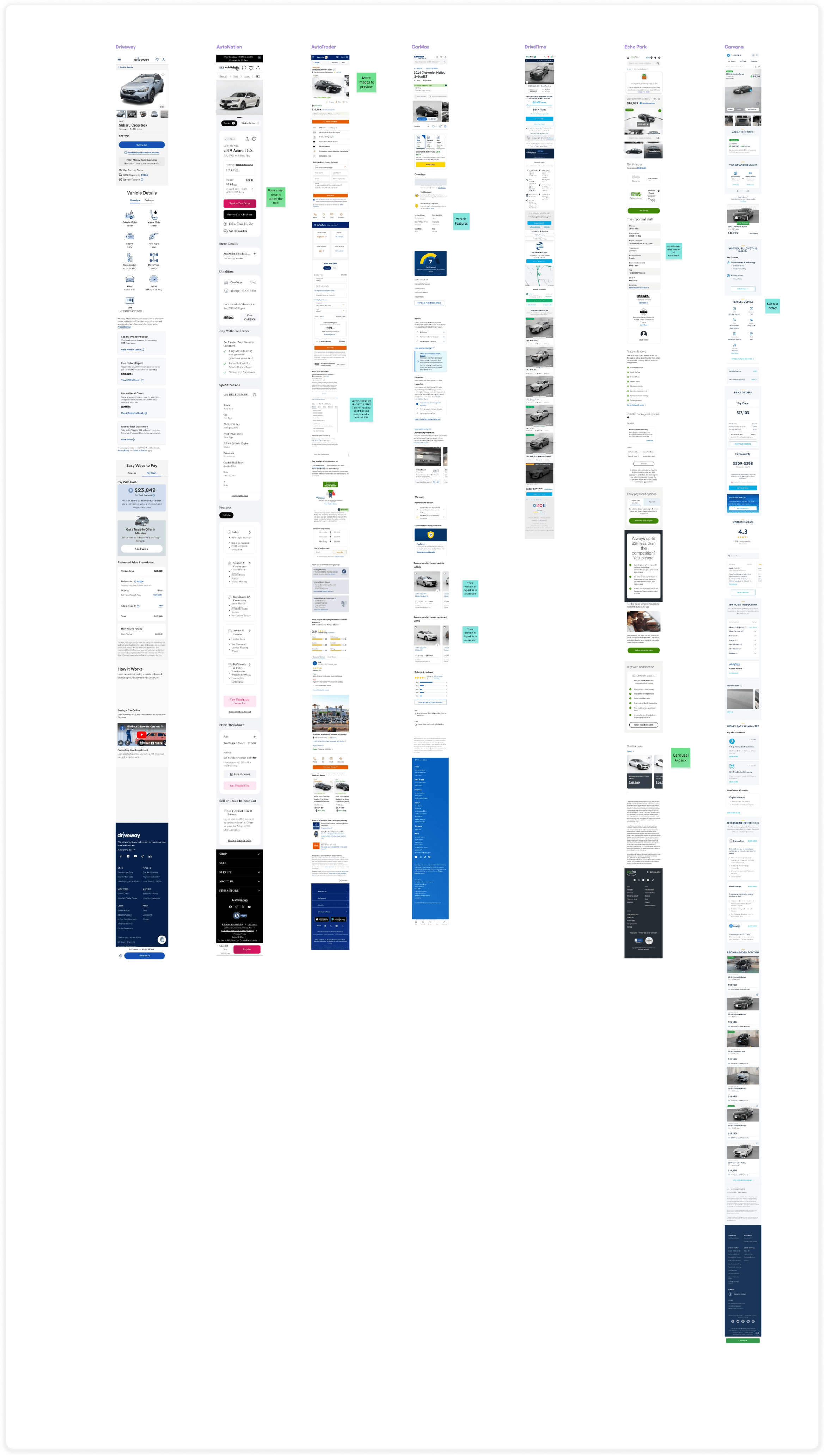
Competitive Analysis
To better understand industry patterns and identify opportunities, I evaluated vehicle detail pages from competitors across the automotive space.
While competitors varied in how they presented financing information, the strongest experiences shared a common theme: they prioritized key actions, reduced competing content, and created a clear path forward for customers. These insights helped inform our approach to simplifying the VDP and improving the hierarchy of information.
Key Insights
Users were engaging with financing tools, but not always with clear intent.
Important actions were competing with a large amount of information for attention.
Customers needed clearer guidance on what to do next.
Reducing visual clutter and prioritizing key actions could create a more intuitive path through the purchase journey.
Challenge
One of the biggest challenges during this project was reconciling conflicting data sources.
Our initial analytics suggested that fewer than 1% of users were interacting with the financing slider, leading us to believe the tool had very low engagement. However, after reviewing session recordings in FullStory and collaborating with our analytics team, we discovered that the click event had been implemented incorrectly. The actual interaction rate was over 50%.
We had reevaluate our original assumptions. While the slider was receiving significantly more engagement than expected, the qualitative story remained the same. Users were interacting with financing tools, but often without clear intent. Session recordings showed customers repeatedly adjusting values, experimenting with different payment scenarios, and spending time within the financing experience without consistently progressing to the next step in the journey.
This shifted our focus from increasing engagement with the financing controls to improving clarity and guidance. The challenge was no longer getting users to interact with the tool; it was helping them understand what actions to take, what information mattered most, and how to move forward confidently.
Solution
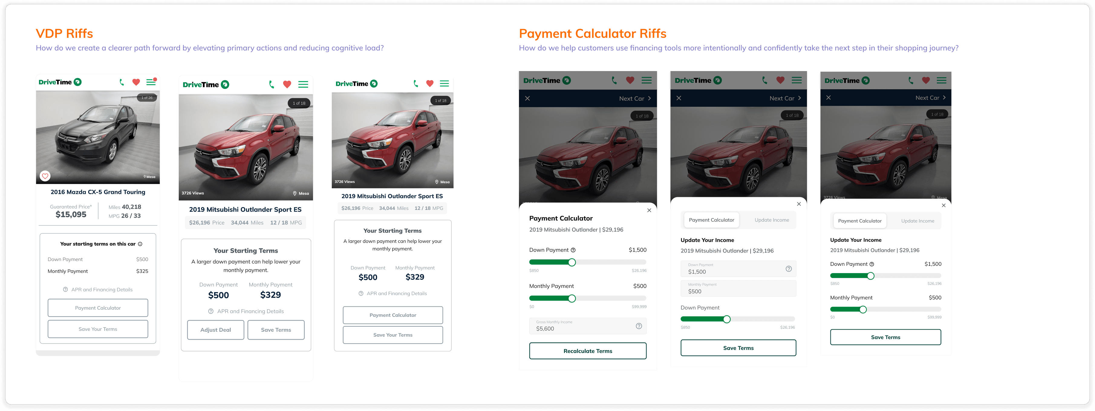
Rather than adding new features, we focused on simplifying the experience and creating a clearer path forward for customers.
Our research showed that users were engaging with financing tools, but often without a clear understanding of how those interactions affected their options or what action to take next. To address this, we redesigned the Vehicle Detail Page around three core principles:
Reduce Visual Clutter
The VDP had accumulated a significant amount of financing information and supporting content over time. We streamlined the experience by removing unnecessary distractions and improving the visual hierarchy, making it easier for customers to focus on the information most relevant to their decision-making process.

Make the Next Step Obvious
Our research showed that customers often struggled to understand how to move forward after reviewing vehicle and financing information. In the original design, the primary actions were buried below the fold and competing with a large amount of content for attention.
We restructured the page hierarchy to bring the most important actions above the fold, making them visible immediately upon landing on the page. This created a clearer path forward and reduced the effort required for customers to take the next step in their shopping journey.
Together, these changes created a more focused and intuitive experience that helped customers understand their options, build confidence in their affordability decisions, and continue through the purchase journey.
Results
The redesign outperformed the production experience across every key metric we tracked.
Our goal was to help customers better understand their financing options and make it easier to take the next step. The results showed that simplifying the experience and creating a clearer path forward had a meaningful impact on customer behavior.
Key outcomes included:
+87–89% lift in Plaid connections, despite no changes being made to the Plaid experience
+53–58% lift in Save Terms engagement
+29% lift in SAV conversions
Increased progression to downstream actions, including scheduled dealership visits
Increased Plaid connections, despite no changes being made to the Plaid experience itself
Stronger engagement from customers who interacted with financing tools and adjusted their down payment
One of the most interesting takeaways was that improving clarity in one area of the page appeared to influence confidence throughout the entire experience. By reducing visual clutter and surfacing the most relevant information at the right time, customers seemed more comfortable taking higher-intent actions.

What I learned
Users were interacting with the financing tools frequently, but not always with intention. By reducing visual clutter, clarifying next steps, and surfacing relevant information in context, we created a more intuitive experience that encouraged users to continue through the purchase journey. The redesign reinforced a lesson that continues to shape my work today: users don't always need more information; they need clearer guidance on what to do next.